

Table of contents


No headings in the article.
Hi fellow dev,
Have you ever found yourself brainstorming ways to make your website or portfolio stand out from the rest of the "boring" ones out there? One effective way to do this is by making your site responsive, as it keeps your readers or potential clients engaged with your content.
There are many ways to make your site responsive, and tutorials are available all over the web. In this article, we'll discuss one popular method: the typing effect.
First, let's take a look at the HTML code:
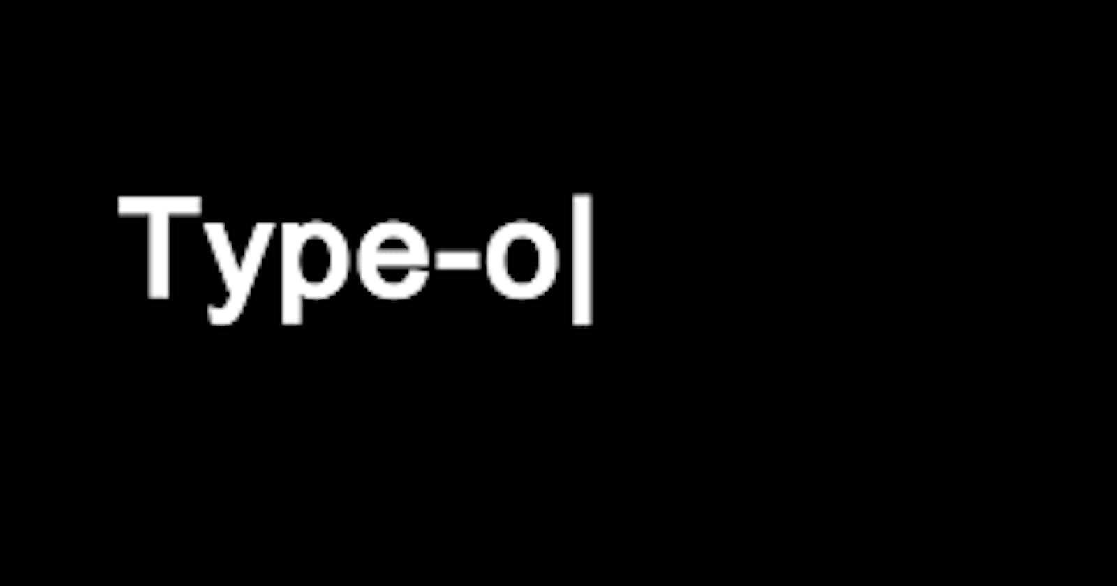
<div class="text-content">
<h1>Hashnode is Gold</h1>
</div>
Now, let's move on to the CSS code
{ display:flex; justify-content:center; background-color:#f1f1f1; }

.text-content h1 { color: #fff; font-family: monospace; overflow: hidden; border-right: .15em solid orange; white-space: nowrap; margin: 0 auto; letter-spacing: .15em; animation: typing 3.5s steps(30, end), blink-caret .5s step-end infinite; }

@keyframes typing { from { width: 0 } to { width: 100% } }

@keyframes blink-caret { from, to { border-color: transparent } 50% { border-color: orange } }
The key concept behind this CSS code is the use of the flex attribute to align the code horizontally, which is crucial for the code to work properly. The .text-content h1 selector targets the h1 tag inside the div with the class "text-content".
The overflow: hidden property ensures that the rest of the content is not revealed until the animation ends. The border-right property creates the illusion of a cursor, even though we both know there isn't one! The white-space: nowrap property keeps the content on a single line, while margin: 0 auto gives us the scrolling effect as the typing animation enhances.
Finally, the animation property sets up two keyframes: typing and blink-caret. The typing keyframe animates the width of the h1 tag from 0% to 100%, which makes it appear as though the text is being typed out. The blink-caret keyframe animates the border color of the h1 tag, making it blink like a cursor.
In summary, the typing effect is a simple but effective way to make your website or portfolio stand out from the rest.
If you encounter any difficulties with this or have any suggestions, please let me know in the comments section. Gracias amigo!